 Back to GanjaTron's site
Split Contrast Printing
Split contrast printing is an advanced B&W technique using multigrade papers and filters. Its primary purpose is to afford the photographer better control of the tonal range during printing using separate filters for the highlight and shadow areas. The resultant prints are rich in tone and better able to accommodate difficult negatives, particularly those with very high contrast.
The Problem
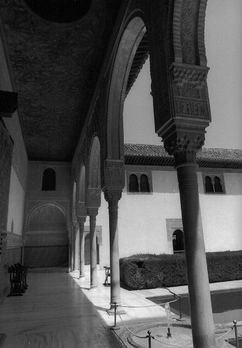
A typical situation which calls for split contrast printing is a daylit outdoor scene with shadow and highlight areas. The corresponding negative is characterised by high contrast. We want to preserve detail in both the shadows and the highlights. Here's a perfect egg sample of a negative from the Alhambra which nearly drove me nuts before I saw the light -- literally!
Making a straight print with a low contrast filter, we wind up with something like this:
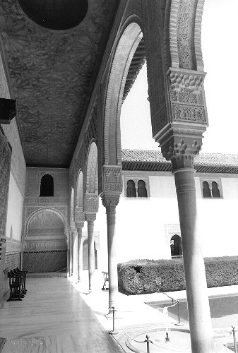
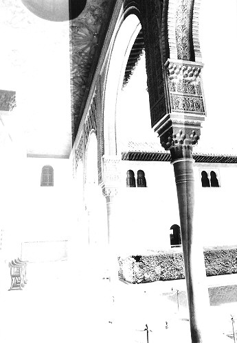
The shadow region under the portico is preserved, alright. In particular, details of the ceiling marquetry are discernible. The region in the courtyard, however, is lacking in detail. We can reduce the contrast by taking a lower filter grade, but that will add to the drabness of the image -- the shadows will lighten and lose substance. Alternatively, we can stick with this filter and increase the exposure, or use a higher filter grade, in which case we get something like this:
The ceiling detail under the portico is now obliterated! The courtyard looks pretty good though -- we've even preserved the texture on the white wall. We can waste an entire evening and box of paper trying to get it right, but we won't get a satisfactory print from this negative -- at least not with one filter grade...
The Solution
The fundamental problem with the above negative is that it requires separate control of the highlight and shadow areas for a successful print. In order to accomplish this, we perform two exposures with different filter grades: a high grade to control the shadows, followed by a low grade to control the highlights. (Needless to say, a sturdy enlarger is a prerequisite for changing filters without disturbing the alignment and focus of the two exposures).
We begin by exposing with the ultrahard #5 filter to "burn in" the shadows and give them substance. For an optimal print, the required exposure (expressed here in terms of the basic exposure for a straight print) must be determined individually for each print. To assess the required shadow exposure, we make a test strip with 1/4, 1/2, 3/4, and 1 × basic exposure (from left to right):
A visual examination indicates 1/2 × #5 (2nd zone from left) as adequate shadow burn-in. Less exposure shows no detail in the ceiling, while more exposure clogs up the shadows.
We now expose for the highlights with the ultrasoft #00 filter. Again, we determine the adequate exposure with a test strip using 1/2, 3/4, 1, and 1 1/4 × basic exposure, having previously burned in the shadows with 1/2 × #5:
Now this is more like it. Texture on the courtyard wall, detailed marquetry on the portico ceiling. The rest is fine tuning. The wall texture emerges at 1 × #00 (3rd zone from left), so we'll stick with that.
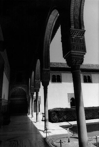
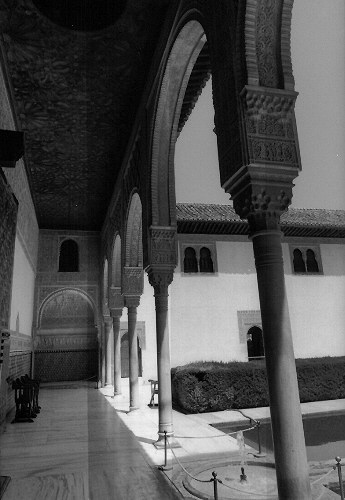
The final split contrast print using 1/2 × #5 + 1 × #00:
Shadow and highlight detail, richness in gradation, tonal balance -- it's all there. Personally, I find this works particularly well for this motif because it better conveys the sense of serenity associated with it compared to a "punchy" print with glaring contrast.
Rules Of Thumb
Useful as it is, the procedure of determining relative exposures for high and low grades individually for each negative is clearly too time consuming and only reserved for those few really good negatives I get every now and then (my hit/miss ratio is actually pretty low). At the same time, I really like what this technique does to my prints, so I fiddled around trying to devise a formula for routine application. Countless wasted papers later, I developed a few rules of thumb for myself which have enabled me to adopt split contrast printing as my standard technique for all my negatives. Of course, your mileage may vary...
The rules are based on the basic exposure and filter grade for a straight print. I use a (remarkably reliable and consistent) Jobo Comparator II lab meter to obtain these parameters, then precede the basic exposure with a shadow burn-in as follows:
| Basic contrast grade | Additional shadow burn-in |
|---|---|
| #0 | + 1/4--1/2 × #5 |
| #1 | + 1/8--1/4 × #5 |
| #2 | + 1/16--1/8 × #5 |
| #3 | None |
| #4 | None |
| #5 | None |
For medium to high contrast grades (#3 and above) there is no need for burn-in since this tends to clog up the shadows. For low contrast grades the burn-in adds substance to the otherwise drab shadow regions and noticeably increases the overall crispness of the print.
Another rule of thumb can be applied to problem negatives with reduced contrast arising from incorrect exposure or from lighting conditions in the motif itself (particularly indoor photos with available light). In my setup, these generally print too dark when I use the lab meter's exposure settings. This is conceivably due to the fact that the tonal range of the negative is shifted toward shadows or highlights, such that midtones in the negative do not map to midtones in the print. A corrective measure I've found to give satisfactory results (though not consistently, your mileage may vary a lot!) is as follows:
- Determine contrast grade for increased/reduced exposure (e.g. ±1/2 × basic exposure) with lab meter, depending on whether the negative prints too dark or too light with basic exposure. Modifying the exposure time is preferable (though less convenient) than the lens aperture, as the latter may affect the focus of the two exposures.
- Burn in shadows according to the above table based on the contrast grade obtained in step 1 but using the basic (not the modified) exposure. The shadows will probably be ok and don't need fiddling -- it's the mid/high tones we're fixing.
- Make 2nd exposure with contrast grade determined in step 1 using modified exposure.
Links
One of the articles that got me started (unfortunately, the other is no longer on the web):Jim Bullard's Printing on Multigrade Paper Using the "Split Filter" Technique
Back to photo stuff
Back to GanjaTron's site